Many bloggers don’t pay much attention to their sidebar blog design, yet this tiny section of your blog can be a powerful asset in helping you achieve your blogging objectives.
A sidebar is an excellent addition to your blog that can help you connect with readers, grow your email list, and make money from ads or affiliates.
While there are many different kinds of sidebars, this article will focus on what would be most useful for the average blogger. I’ll start by explaining what exactly a sidebar is, then jump right into how you can create one that works for you.
What is a blog sidebar?
A blog sidebar is a secondary column on the right or left side of a web page that provides additional information either about the article, or your blog in general.
In many cases, it’s used as navigation for blog posts and articles with widgets such as popular, latest, and related posts.
Sidebars can also be used to display advertisements, social media links, and more.
What is the purpose of a sidebar?
Sidebars are designed to help you engage readers by recommending what to read next, as well as direct them into taking the desired conversion action such as joining an email list or purchasing a product.
You can also use sidebars to organize your content, highlight important posts and pages on your site, and offer navigation options for visitors who don’t want to scroll through all of your content.
Another main purpose of blog sidebars is to help you generate more blog revenue by promoting display adverts and affiliate offers.
Sidebars are typically placed either along the right or left side of a website’s main column of text; this makes them easy for readers to spot when they first come across a new blog post.
Some websites have multiple sidebars: one on each side of the main content.
How to create a blog sidebar that works
To create an effective sidebar, I recommend you follow these steps:
1) Identify and define your blog’s main purpose:
An effective sidebar can help you achieve the intended purpose of your posts, whether it’s
- Improving your brand perception,
- Converting visitors into leads,
- Generating product sales, or
- Boosting ad clicks.
Your main objective should inform the types of widgets that you choose to include in your sidebar.
For example, if you use your blog to demonstrate thought leadership, then having an about you widget that shows your face, and your bio can help, as well as showcasing some of your most read articles.
2) Stay on brand
When it comes to the design of your sidebar, you don’t want to deviate from the overall design of your blog.
A strong, consistent brand will help set you apart from other bloggers in the same niche area and make it easier for readers to recognize your work. Your branding should extend across all sections of your website, from archive pages, and 404 pages, to single post layouts and yes, your sidebar.
As far as the sidebar goes, two main factors go into creating good sidebars: consistency and functionality.
3) Choose a modern and functional design
Once you’ve decided on the layout and style of your sidebar, it’s time to think about the functional aspects.
The most important thing in terms of design is to make sure your sidebar works effectively with the rest of your site. Using a grid system and modular approach allows you to create a clean, modern look that’s easy for users to follow and understand.
You’ll want to choose a responsive design so that it displays well on all devices (desktop computers and tablets). Consider using a mobile-first approach or minimalist design.
Also, leverage the power of whitespaces to improve the readability of your sidebar widgets. Whitespace helps you create a minimalistic and more professional look on your designs. It also ensures that the readers aren’t overwhelmed by what they see on screen.
By spacing your widgets sufficiently, you improve the user experience of your sidebar layout, as the readers can easily find what they are looking for.
Finally, with color schemes, you want to go really subtle here. Your color scheme should help create harmony between elements within your layout.
Use lighter greys for backgrounds, white for whitespaces if your widgets have a different background than that of the sidebar, and stick to the accent colors that default to your design.
This will give your layout an overall neat and professional look, instead of chaotic and messy.
4) Decide on what widgets to include
Once you’ve done your research, it’s time to start working on your sidebar.
A widget is a content block with a specific function that you can place on sections of your website such as the sidebar, the header, the footer, etc.
They include information such as recent posts, social media links, and contact information amongst others. They’re easy to add, but can also be very distracting if you have too many of them. So make sure to use only 1-3 widgets per sidebar (on most blogs).
The widgets you choose should be those that fulfill the purpose of your sidebar. And with widgets, too many is too many. Only feature 2-5 widgets.
5) Start Building your WordPress Sidebar
Now since you have a plan, it’s time to implement it. Most WordPress widgets have sidebar and widget functionality. To set up your sidebar, follow the steps below:
- From your WordPress admin dashboard, navigate to Appearance>> Widgets.
- The next page shows two sections: Available widgets, and the regions where you can add the widgets.
- If your theme supports sidebar(s), then you will see a region titled Sidebar on the right.
- Drag the widgets to the sidebar section, set them up accordingly, and then hit Done or Save to ensure that the changes are saved. You can hit Delete to remove the widget, or simply drag it back to the Available widgets section.
- If your theme allows, choose where you want the sidebar to feature (left, right, or custom)
- To add custom sidebars, and hence have better control over the locations of your widgets, you can use a custom sidebar plugin like Custom Sidebars.
The 7 best WordPress widgets to include on your blog sidebar
Here are some of the best widgets to include on your blog sidebar:
- Search Bar: To help people easily find new blog posts to read
- About you blurb widget: To help add a human touch to your content
- Author bio widget: Provide more information about the article author
- Blog post info widget: To add details such as post-publication date, author, category, tags, etc.
- Sidebar menu design: Add navigational items to your sidebar
- Categories List: Display a list of main categories to help readers navigate through
- Popular posts widget: Feature your most read articles
- Social media widgets: Encourage people to share and follow you on social.
- Email signup widget: For building your email list
- Sticky widgets: Use this feature to drive clicks on your main widgets such as CTAs, affiliate offers, or adverts.
- Display ads: Feature ads on your sidebar
- Call to action widgets: Design elements that have a specific purpose of conversion
- Links to your products: You can feature your relevant products on your sidebar based on given parameters such as blog post categories and tags
Sidebar Design Ideas (Types of Sidebars)
Here are some cool sidebar layouts and styles to inspire your next sidebar design project.
1) Right-aligned Sidebar
This is perhaps the sidebar layout you are used to. The main content appears on the left, while the sidebar is positioned at the right of the screen. This allows the reader to focus on the content, and only explore the sidebar if they see something interesting.
2) Left-aligned sidebar
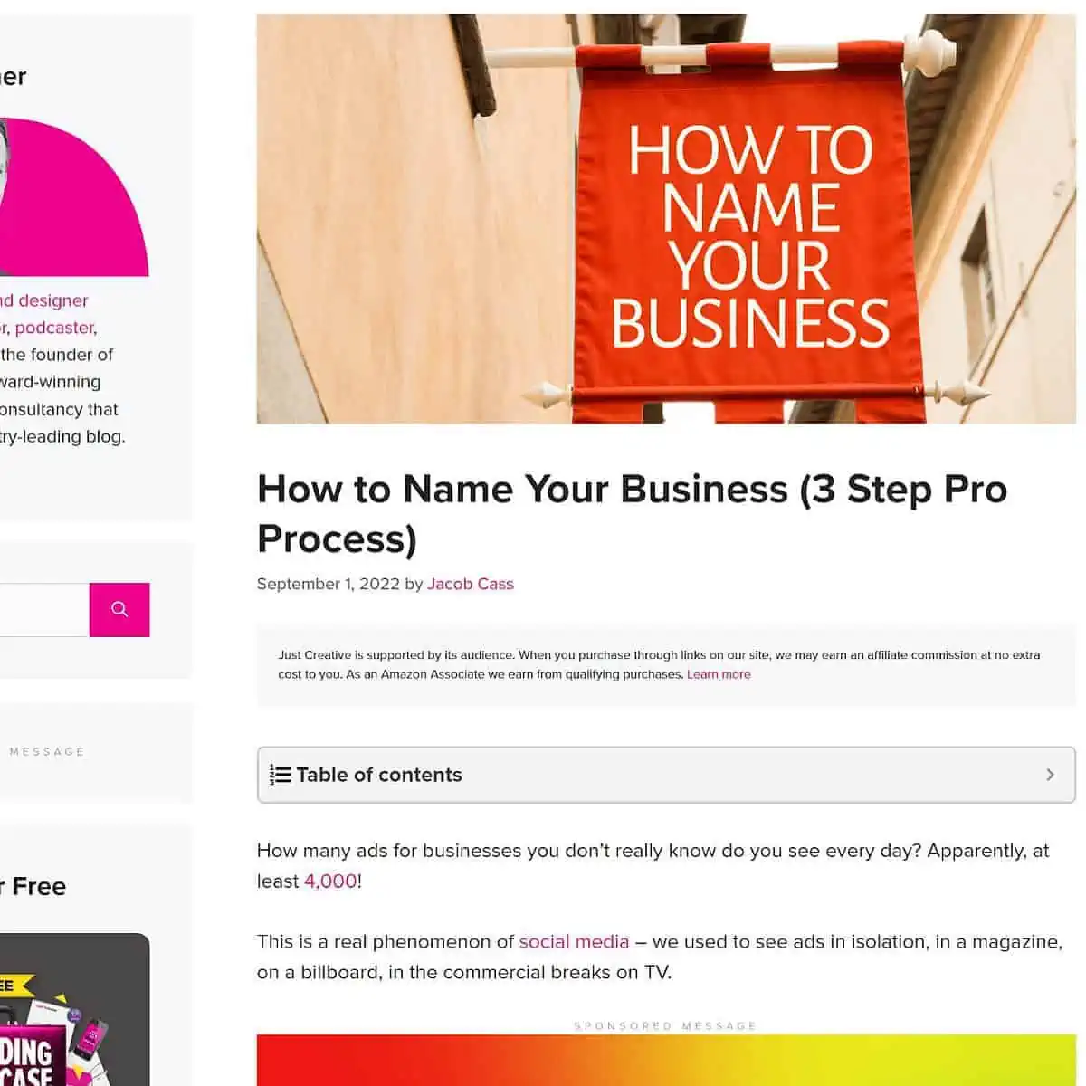
The left sidebar, though not as common, is a great way to ensure that your widgets get enough attention.
Careful though, by using this sidebar layout, you reduce the engagement and hence the overall performance of your main content.
3) Fixed sidebar
This is a great layout for websites that require more screen space. It’s also great for sites with a lot of content, as it allows users to focus on the most important information without distractions from other elements.
With the fixed sidebar, you can remove the header navigation, and add your necessary nav items in the sidebar.
The sidebar doesn’t change when you scroll down, so it will always stay in place as you browse through your site.
4) Centered Content and Two Sidebars
A centered sidebar is a good option for sites that need to highlight certain content and keep it in the spotlight.
This layout allows you to focus on one particular piece of information, while still giving users access to other important content.
This is another good option for sites with lots of content. You probably have seen this on news blogs. However, you don’t have to overdo it as most news websites do. Instead, you can allocate each sidebar two distinct roles, which can then inform the types of widgets that go to each sidebar.
For instance, you can use the left sidebar to show a table of contents, and post info, and the right sidebar for promotional stuff like affiliate banners and display ads.
When used subtly, and intentionally, the two sidebars can better help you achieve your blogging goals.
Sidebar Blog Design
To recap, here are the tips for creating your blog sidebar:
- Identify the main purpose of your blog sidebar
- If need be, create different sidebars and allocate them to different post types such as posts, pages, reviews, products, etc.
- Ensure to match the overall design of your blog when crafting your sidebar
- Focus on functionalities and user experience rather than just a beautiful layout
- Be intentional about what WordPress widgets you include on your sidebar
- Stick with the right sidebar design, as this is the best for blogs
Let’s now explore some of the best sidebar blog designs to help you have a rough idea of what is possible, even with a minimalist approach to design.
Sidebar Blog Design Examples
1) The PennyMatters Sidebar
The PennyMatters blog sidebar is aimed at monetization and on-site experience. The top section is dedicated to post info such as author details and pageviews, and the recommended posts based on the current category.
The middle features affiliate CTA, and display ads, while the bottom has a sticky ad widget.

Widgets: Post info, recommended posts, affiliate call-to-action, and display ads.
2) Seth Godin (Fixed Sidebar)
Seth’s blog utilizes minimalistic design, and this is also apparent from his sticky sidebar.
His main objectives are apparent if you investigate the design of his blog sidebar: Brand awareness and conversion.
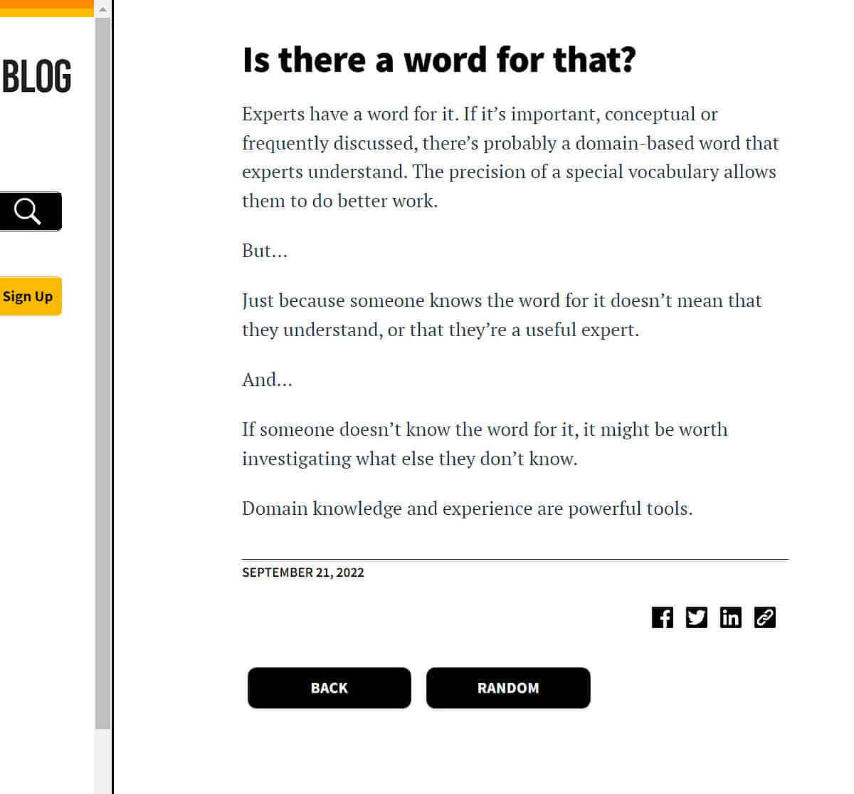
Widgets: About blurb, search bar, opt-in form, product links, popular posts.
3) ConvertKit Blog (No Sidebar)
ConvertKit blog is another brand that takes minimalism to the next level, and without featuring a sidebar, you tend to wonder how the website captures leads.
Well, the site utilizes in-article widgets, which would have otherwise been placed in the sidebar. Blog post info (Author and time to read) appears at the top, while the blog outline is within content, aligned at the top-right.
There are also two opt-in form widgets, one within the content, and the other appearing at the end of the post
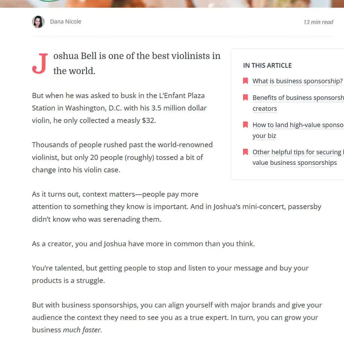
In-content Widgets: opt-in form, blog outline, post info
4) Copyblogger Blog Sidebar
The last time I checked, copyblogger had done away with their sidebar, but it appears they have brought it back.
What you will note right away is that their sidebar is pretty much narrower than most sidebars that you are familiar with, and this could be by design.
Their sidebar layout is optimized for conversion and only has three widgets.

Widgets: Call to action, product promo, popular posts
5) Addisson Lacroix Blog Sidebar
Addisson Lacroix’s blog sidebar is a typical example of a standard modern sidebar layout.
By having a wider layout, Addisson wants people to pay attention to the contents in the sidebar, and not just the articles.
The top section has a prominent opt-in form, which tells us that the primary goal of this sidebar is to get people to sign up to an email list.

Widgets: Opt-in CTA, social media icons, featured posts widget, author bio.
5) Online Biz Booster Sidebar Design
This sidebar design neatly marries into the overall design of the onlinebizbooster website, with a golden yellow color scheme spread throughout the layout.
At the moment, their sidebar is designed to encourage people to stay on the site longer, with the best-of posts widgets. The widget shows over 20 posts, each with a featured image and a post title. Also, the last posts remain sticky as you scroll down the pages.

6) Nielsen Norman Group Blog Sidebar
Being a professional brand, Nielsen Norman Group uses the left sidebar to enhance user experience with widgets such as categories list and popular post widgets.
They also manage not to divert much attention from their main content by employing a wider layout for their articles.
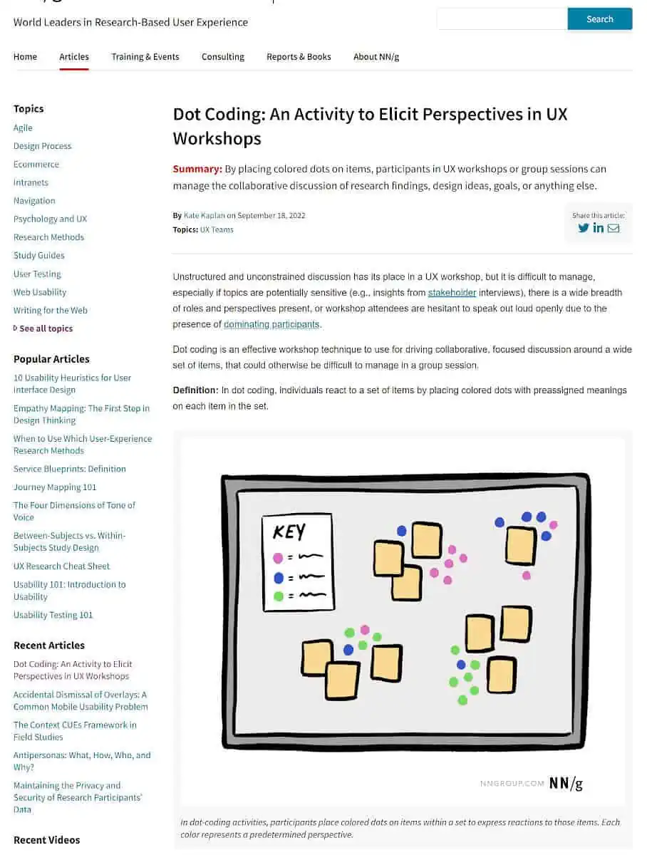
Widgets: Categories, Popular posts, Recent articles, Author list, and Recent videos.
7) Smashing Magazine Sidebar
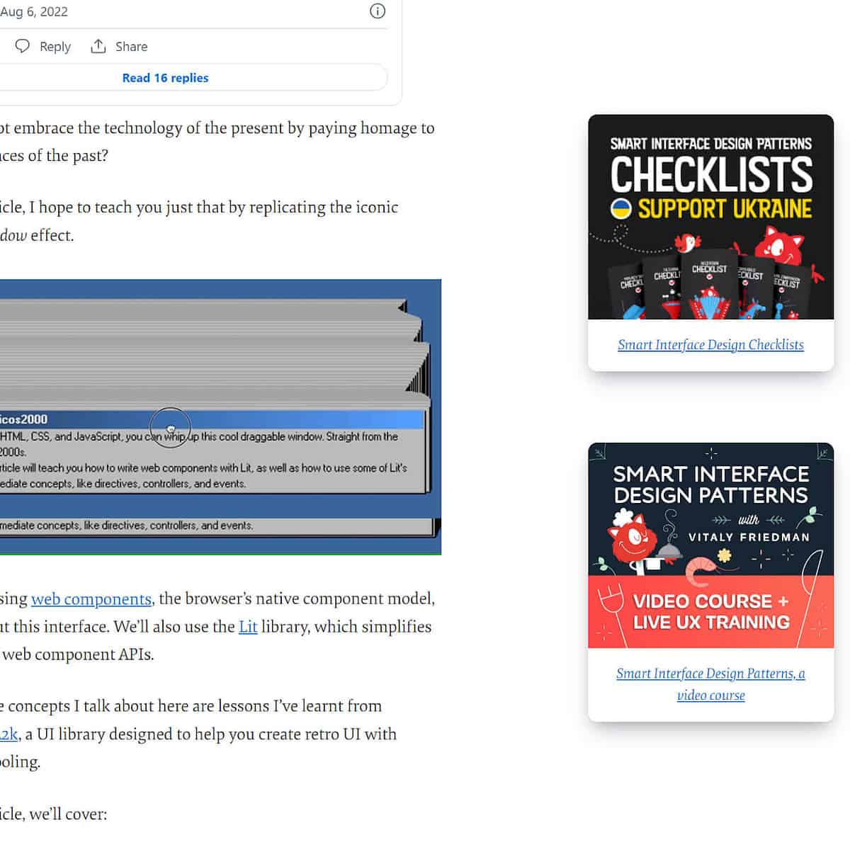
From the surface, Smashing Magazine can easily trick you into believing that their sidebar only has two widgets: The author bio and the email opt-in form, but if you stick around, then other widgets will start emerging as you interact with the page.
This hack helps focus all the attention of the users on their main CTA, which is email subscription.
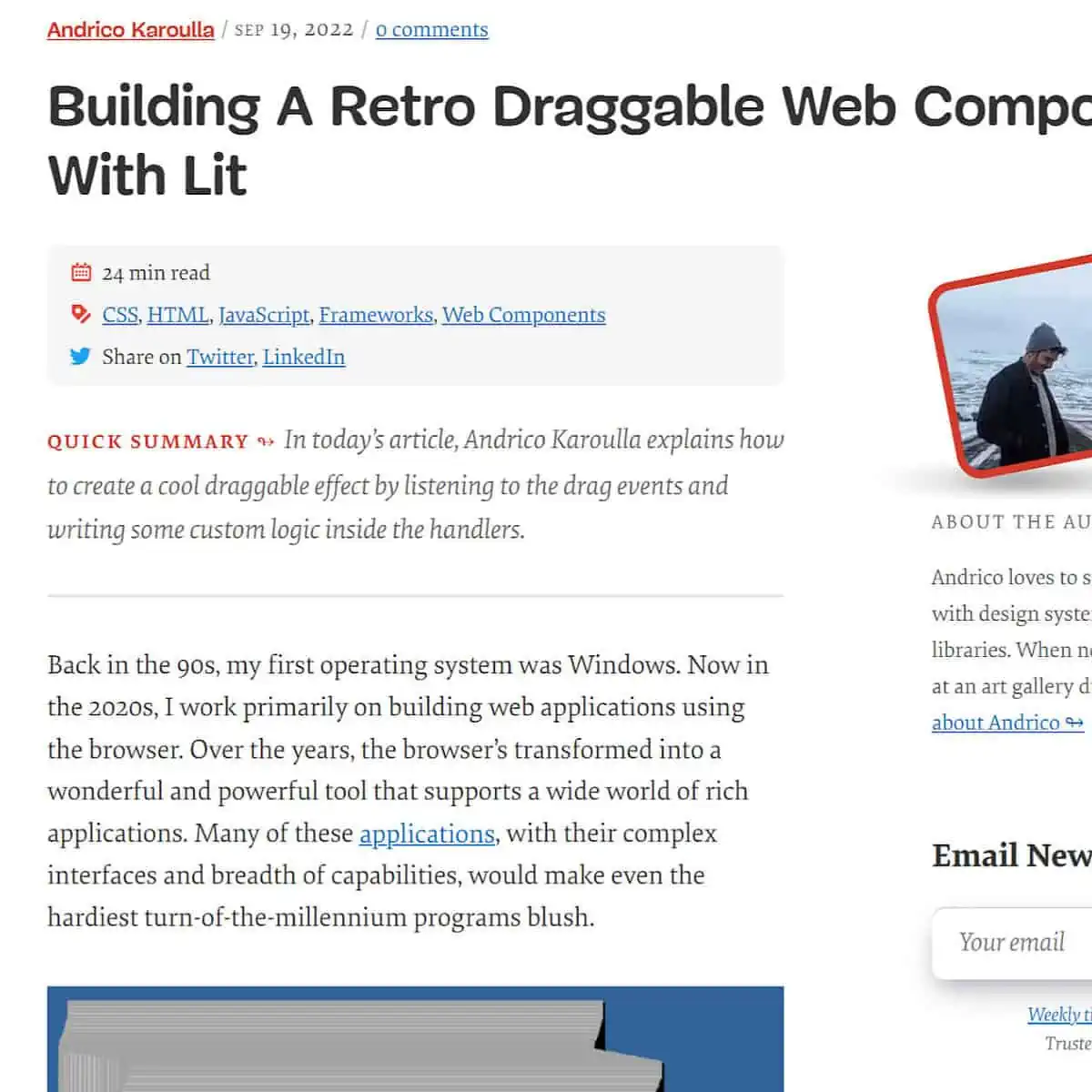
After scrolling down further, other widgets start appearing again on the sidebar
8) Royal Elementor Demo Site
I decided to include this sidebar from a demo website by the Royal Elementor add-ons team, as it represents what most sidebars still look like today.

9) Addicott web (2 Widgets Sidebar)
Who said you need to have 3-5 widgets? Oh, I did! But 2 widgets are good enough. And when those two widgets only occupy ⅓ of the screen, even better. No scrolling!
Addicott web cleverly uses 2 widgets only to help people navigate to other parts of their website.
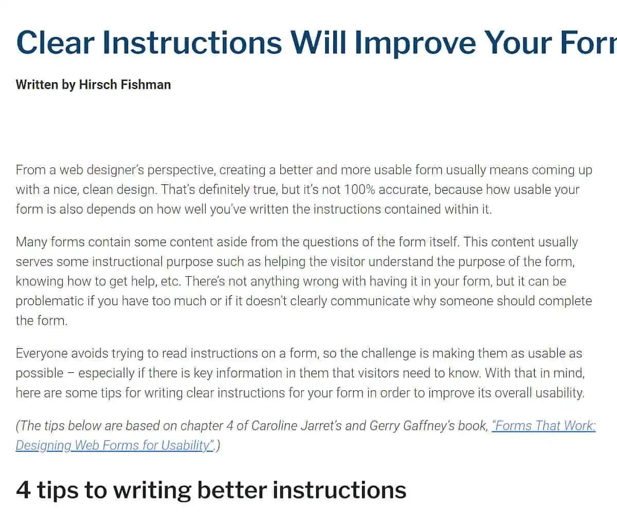
Widgets: Categories and Archives WordPress widgets
10) Esther Perel’s Blog Sidebar
Esther Perel is a relationship coach and expert and uses her blog to share advice on all matters relationships.
Her blog sidebar only features three widgets. What got my eye with her blog is how she neatly spaces her widgets in a way that makes one just want to explore the sidebar. The sidebar is also wide enough, so there’s that.

Widgets: Email option form, a quote card, and featured posts
11) UpJourney

Widgets: Email option form, display ad widget
My Final Thoughts on WordPress Blog Sidebar Design
The sidebar is an excellent addition to your blog that can help you connect with readers, grow your email list, and make money from ads or affiliates. It’s also a great way to display valuable content that might otherwise be buried in the depths of your website.
I hope that this article has helped you understand how to create an effective blog sidebar.
A well-designed sidebar can be a powerful tool for building your brand and attracting new customers, so it’s worth investing time in getting it right.
